After Hans Holbein
It Looked Fine from Here
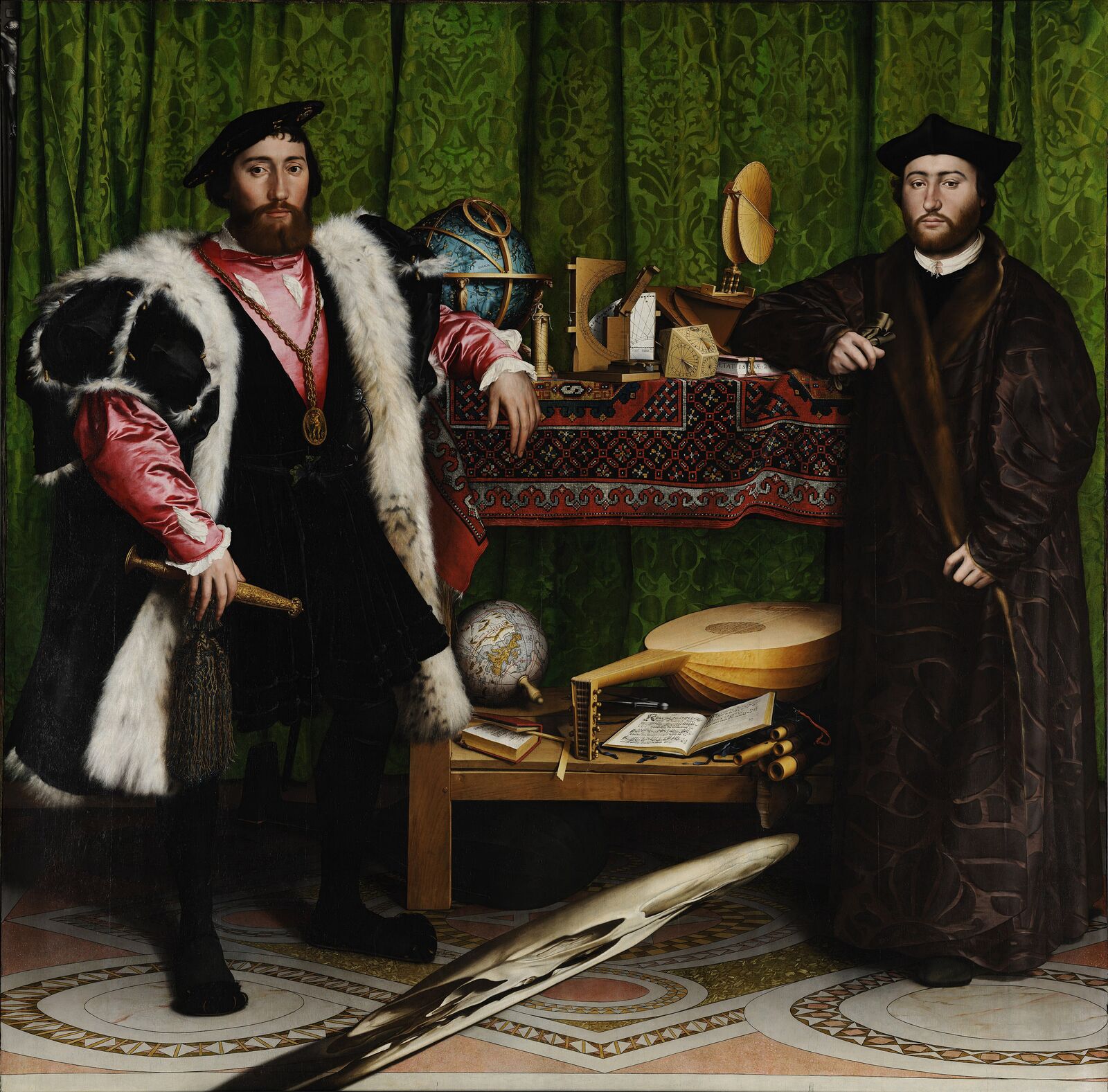
London, 1533. Holbein paints the French ambassador and a bishop friend among their globes and sundials. Across the floor lies something long and pale. From the front, it’s hard to say what.
Tabs versus spaces
Either one works.Both at once doesn’t.
It is more important to agree upon an order than which order is agreed upon.Danny Cohen, On Holy Wars and a Plea for Peace, 1980
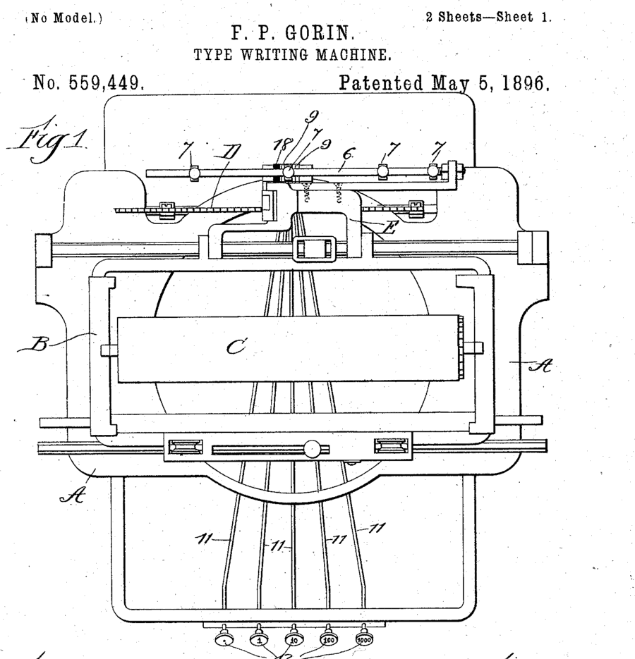
A tab was never a width. Typewriters got tab keys so clerks could type tables. In 1895 Fred Gorin of Chicago patented extra keys that sent the carriage along so that “all units in a column shall fall under each other,” and a 1923 history says his tabulator went on sale in 1898 as an attachment for the Remington. Stops on a rack behind the carriage told it where to land, and whoever sat at the machine set them. The ASCII standard of 1963 gave the tab a code, 9, and its later editions define it the same way: move to “the next predetermined character position.” Nothing in it says eight. That came from Unix, whose terminal driver rounded a tab up to the next multiple of eight in 1975, and from the tools that followed. less, which pages through git diff, still shows a tab eight columns wide unless you tell it otherwise.
Danny Cohen was writing about byte order, not whitespace. He borrowed the Big-Endians and Little-Endians from Gulliver’s Travels, who went to war over which end of an egg to break.
The war
The Jargon File, the hackers’ dictionary, defines holy wars as “flame wars over religious issues,” in which “the actual substantive differences between the sides are relatively minor.” Its entry on indent style ends: “Doubtless these issues will continue to be the subject of holy wars.” In May 2016 an episode of HBO’s Silicon Valley ended a romance over it. In Stack Overflow’s 2017 survey, professional developers split almost evenly: 40.7 percent tabs, 41.8 percent spaces, 17.5 percent both. David Robinson found that the spaces group earned about 8.6 percent more, even after accounting for experience and other factors, and added that “correlation is not causation.” A year earlier Felipe Hoffa had counted the indentation in 11 million unique files from 400,000 GitHub projects. Spaces won in every language he checked except C and Go.
The bug is both
Mixing them is the one thing nobody defends. The first version of PEP 8, Python’s style guide, said it in 2001: “Never mix tabs and spaces.” Python 3 refuses code where the mix makes the indentation ambiguous, and stops with TabError: inconsistent use of tabs and spaces in indentation. Make went the other way and demands a tab before every command. Stuart Feldman, who wrote it at Bell Labs, explained: “I just did something simple with the pattern newline-tab. It worked, it stayed. And then a few weeks later I had a user population of about a dozen, most of them friends, and I didn’t want to screw up my embedded base. The rest, sadly, is history.” GNU Make let recipes start with something else in 2010.
The case for tabs
A tab says “one level” and leaves the width to whoever is reading. In 2019 a programmer wrote that two visually impaired coworkers needed it: “one of them uses tab-width 1 because he uses such a gigantic font-size,” and “the other uses tab-width 8 and a really wide monitor.” With spaces, they had to convert each file, do their work, and convert it back before committing. Go’s formatter indents with tabs and aligns with spaces. The Linux kernel uses tabs eight wide, and its style guide calls shallower indents “akin to trying to define the value of PI to be 3.” Biome, the formatter that keeps this gallery’s code, indents with tabs by default. The 2020 proposal that chose it, when the project was still called Rome, argued that letting people pick their own width was a matter of accessibility.
The case for spaces
A space is one column in every editor, terminal, diff, code review, email and web page, so what you saw is what everyone sees, and anything you lined up stays lined up. PEP 8 now says it plainly: “Spaces are the preferred indentation method,” four per level. Prettier, the JavaScript formatter, still defaults to spaces; a proposal to switch it to tabs for accessibility has been open since January 2020. Browsers draw a tab eight columns wide unless the page says otherwise. GitHub added a tab width setting in September 2021, and in 2025 made it apply everywhere, including code in Markdown.
What to do
- Pick one per project. Cohen’s point about byte order holds for whitespace: agreeing matters more than which answer you agree on.
- Let a machine keep it. Run a formatter in the editor and again in CI, so whitespace never comes up in review. “Gofmt’s style is no one’s favorite, yet gofmt is everyone’s favorite,” as Rob Pike put it in 2015.
- Write it where tools read it. An
.editorconfigfile withindent_styleandtab_widthtells many editors what the project uses before anyone types. - With tabs, indent with tabs and align with spaces. A tab used to line up a column only lines up at your width. That’s the rule gofmt follows.
- Reformat in a commit of its own. Whitespace changes across a file bury the real ones in diffs and blame. Do it once, and separately.
About the picture
Hans Holbein the Younger painted The Ambassadors in London in 1533, in oil on ten vertical boards of Baltic oak, 207 by 209.5 centimeters. On the left is Jean de Dinteville, the French ambassador, whose dagger sheath marks him in his 29th year. On the right is his friend Georges de Selve, Bishop of Lavaur, in his 25th. That May, Dinteville wrote to his brother that he was “the most melancholy, weary and wearisome ambassador that ever was seen.” The shelves hold a lute with a broken string, a hymnbook open at two of Luther’s hymns, and Peter Apian’s arithmetic for merchants, open at division. The National Gallery bought the painting in 1890.
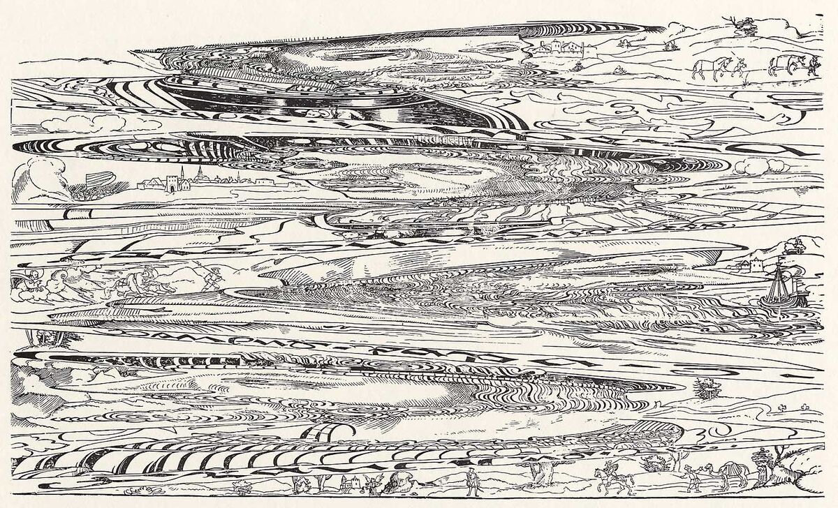
The skull is a perspective distortion, not a mirror trick. The Gallery’s catalog puts the best place to see it about 79 centimeters past the right edge of the panel and 12 centimeters out from its surface, and that is where the camera stands in this room. When the painting was restored between 1993 and 1996, the Gallery’s restorers photographed a model skull, distorted the photograph to match Holbein’s, and used it to guide their repair of the parts that had worn away. Cutting the painting into eighteen lines, the editor around it and the two crews are ours.